Property Details Page
Property Details Page
Property Details Page
A UX case study challenging the current layout and usability of a core home search page.
tl;dr
The challenge
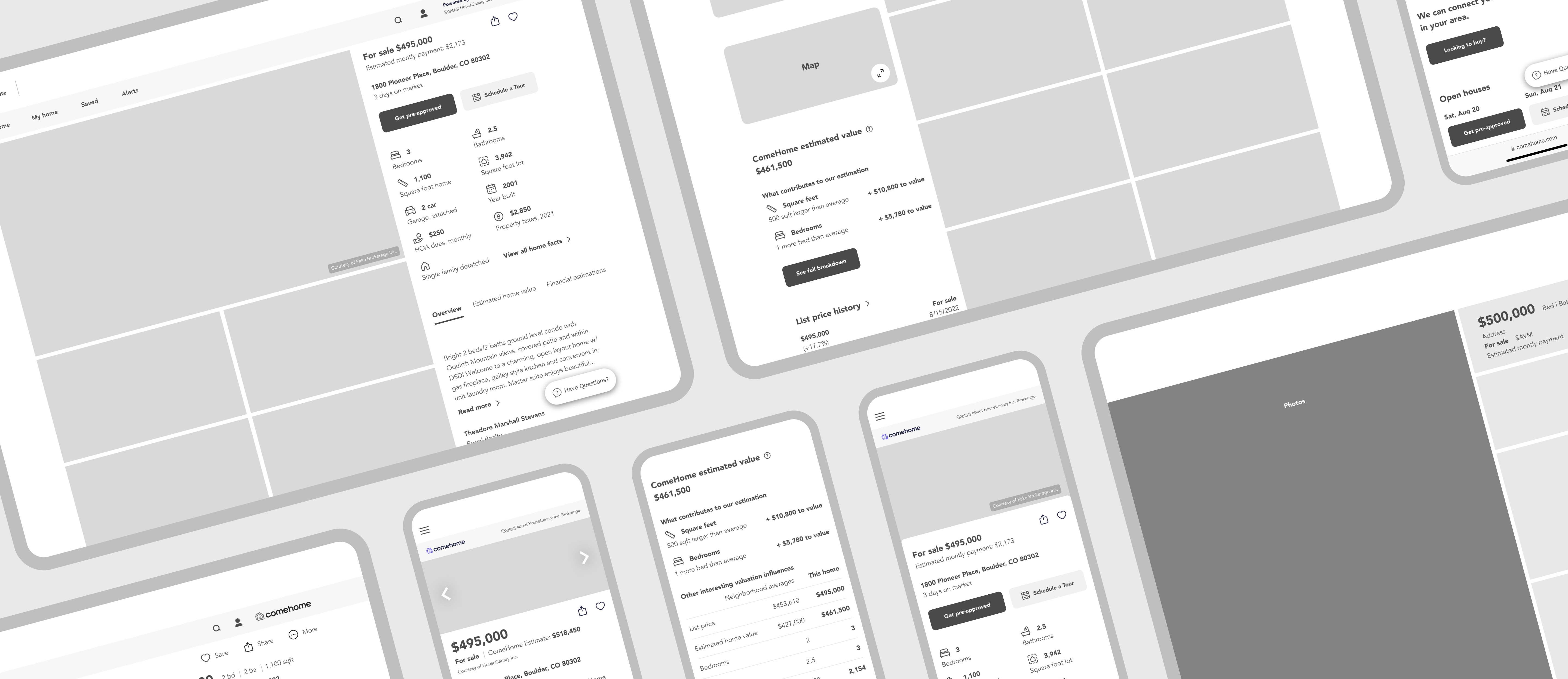
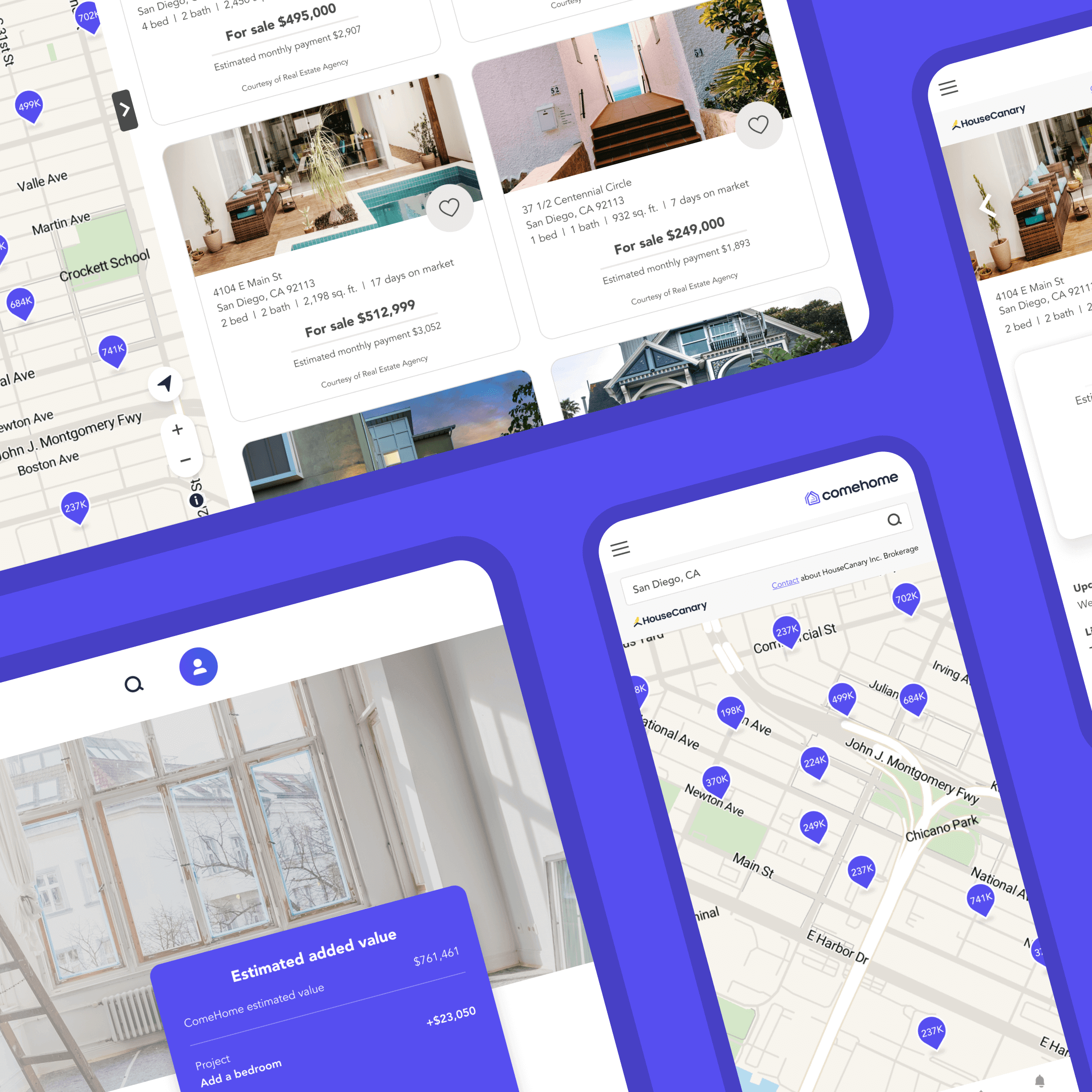
The property details page (PDP) is where home buyers find out all they need to know before going to tour that home or moving on to the next one. With so much information available, we wanted to make sure that we were prioritizing what people feel is the most important. Additionally, we wanted to find a balance between user needs and the organization's goals.
My role
I worked with product managers to zero in on our organization's goals and how those may surface on the PDP. From there, I ran user tests to get feedback from the public. I then distilled the results and factored in the company goals and created wireframes.
Round one
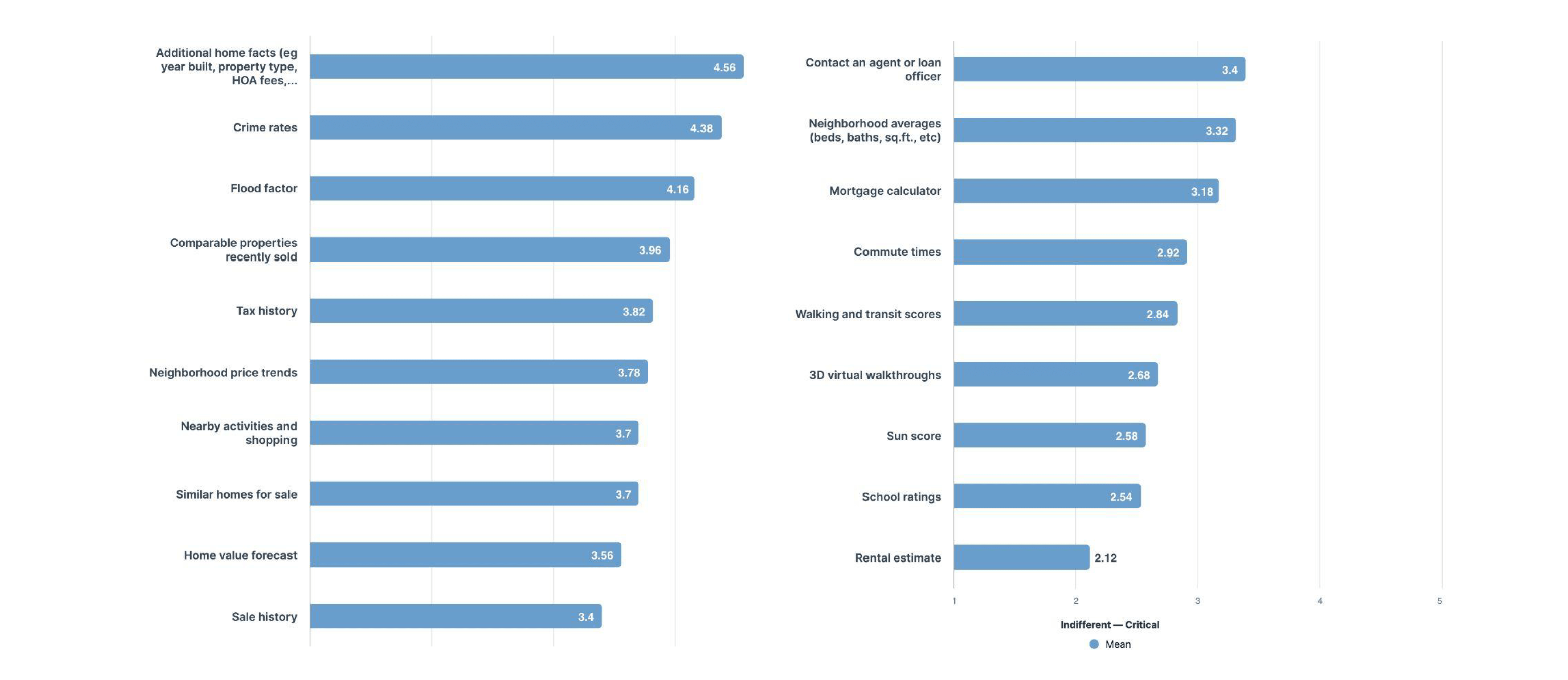
Task
When purchasing a new home, what is most important to you? Please rate all of the following items accordingly.
(Answers rated from 1–5, 1=indifferent, 5=critical)
Learnings
Buyers are most interested in see the facts about a home.
Interestingly, these additional home facts were already available on the PDP but were hidden in a collapsed menu. Upon seeing these test results, we adjusted the current PDP to always show these additional home facts.
Round two
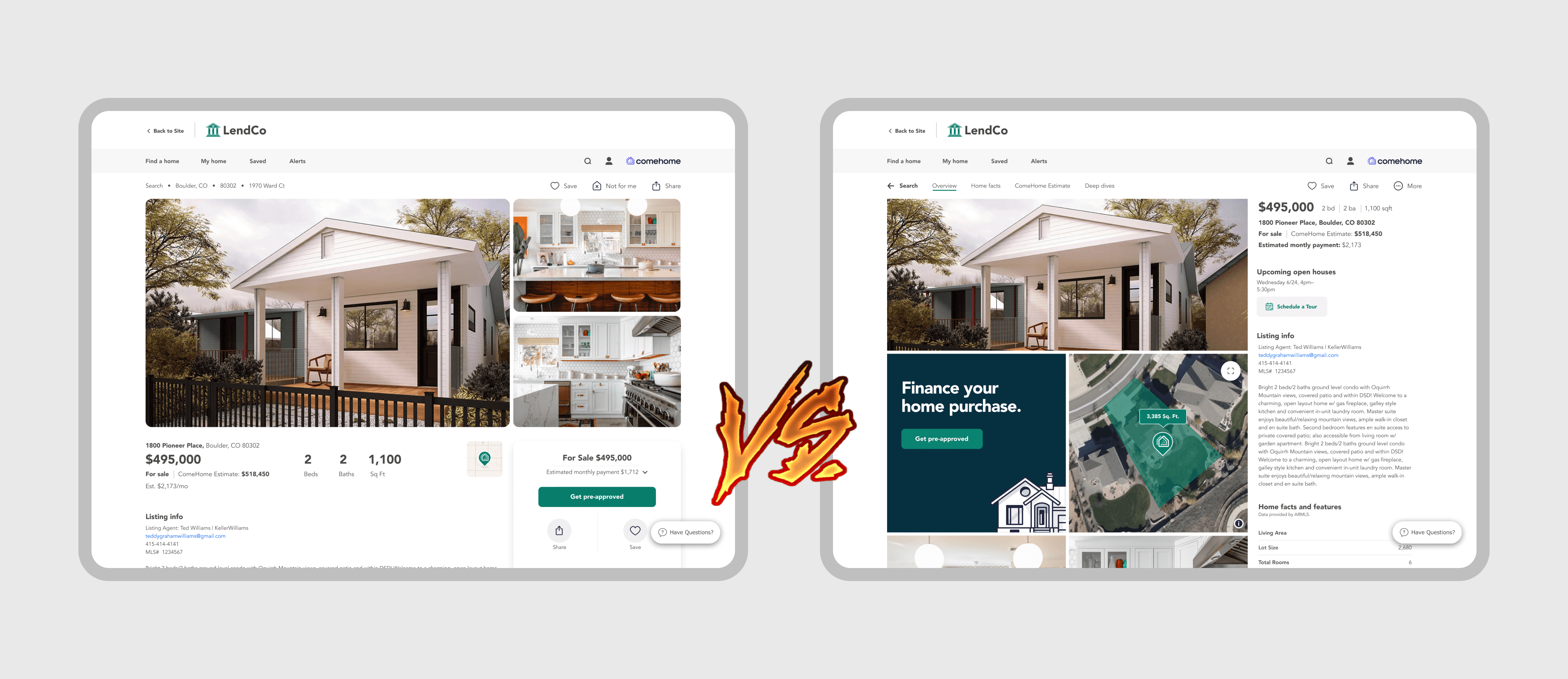
Layout A/B test
As a quick proof of concept, I took the existing PDP and redesigned the page in two different layouts. I then sent out these layouts to test them against each other. After the test I compared the results to see if there was a preference of one to the other.
Findings
The results showed that each layout had it's strenghs and weaknesses. All in all it seemed like testers didn't have a strong preference one over the other.
But wait there's more...
I also timed the tests.
When you crunch the numbers it looks like there's still no clear winner.
Yeah...
Layout A took on average 6m 5s to complete
Layout B took an average of 6m 10s.
Sounds like two strong options!
So what now?
Even with these findings there was still one thing that we as a team knew—the majority of the ComeHome user base use our mobile site.
Mobile first it is!
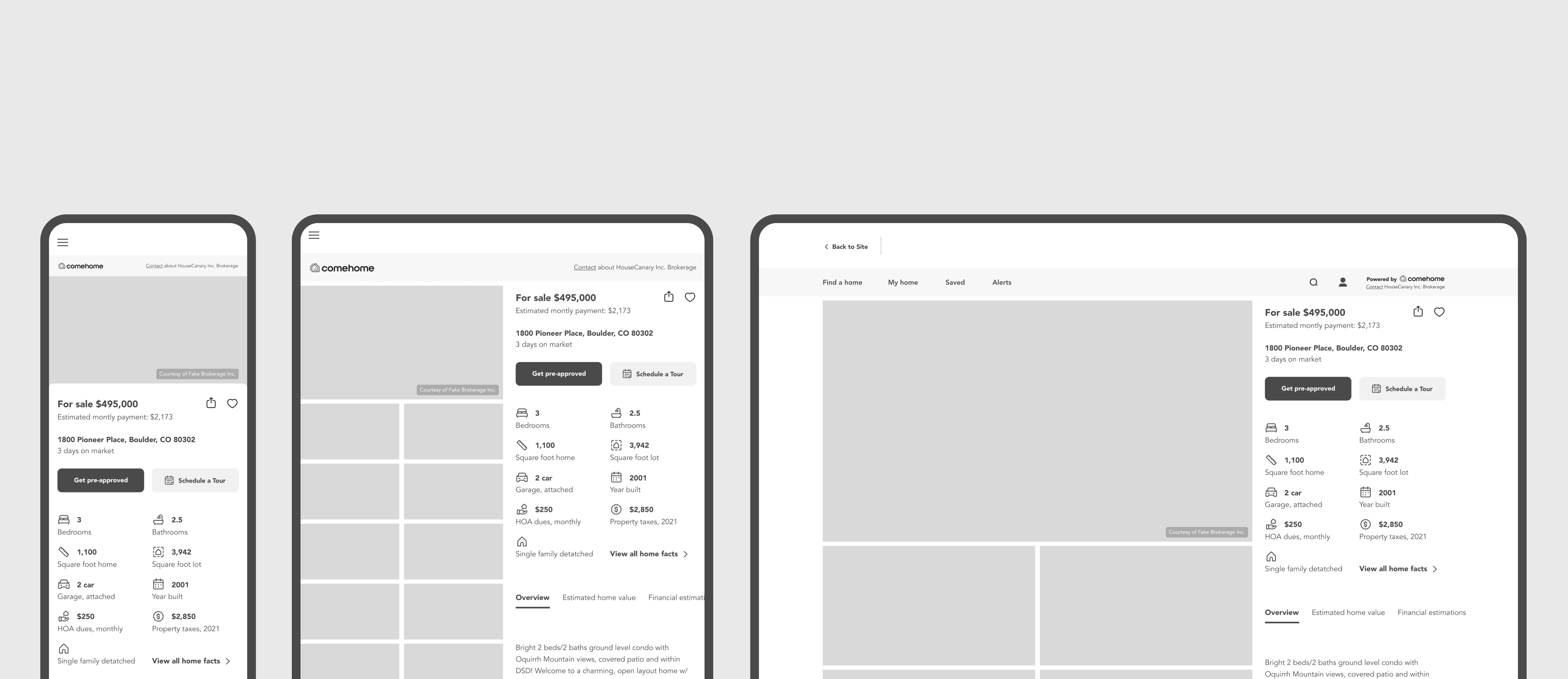
This means Layout B has the clear advantage as this layout was designed to organize all the content in a mobile width container kept to one side of the page.
How cool is it that the mobile layout scales so well across different screen sizes!?

© 2025 Chris Walker